Throughout history, painters and authors have recommended various palettes of color. While some give insight to the painter's working style, others offer a simple palette for mixing, but typically limit color possibilities. GOLDEN has created a palette of eight professional acrylic colors to provide you with the potential to mix the widest range of colors.
The Selection of Colors for Mixing
Titanium White
Zinc White
Quinacridone Magenta
Naphthol Red Light
Hansa Yellow Medium
Phthalo Green(Blue Shade)
Phthalo Blue(Green Shade)
Yellow Ochre
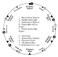
For this palette, the three mixing primaries are Hansa Yellow Medium, Quinacridone Magenta and Phthalo Blue (Green Shade). Our standard recommendation is Quinacridone Red, but we chose Quinacridone Magenta for mixing a broader range of violets and purples.
Naphthol Red Light (#4) helps balance the Quinacridone Magenta (#3). Mixtures with Hansa Yellow Medium (#5) reveal a wider selection of intense reds and oranges. Mixtures with Phthalo Blue (Green Shade) (#7) allow deep reds and maroons.
Phthalo Green (Blue Shade) (#6) assists Phthalo Blue (Green Shade) (#7). Mixtures with Hansa Yellow Medium (#5) produce a great range of greens, particularly subtle yellow greens. This green also helps create a diverse range of earthtones.
Yellow Ochre (#8), a natural earth color, helps "warm" the color mixtures and subdue the brightest colors.
Titanium White (#1) is an opaque white for mixing pastel tones. Zinc White ( #2) is an extremely transparent white for subtle tinting and glazing.
The Qualities of Color
To describe color we need to understand three qualities: Hue, Chroma and Value.
Hue is another word for color. It describes the actual color of something. Red, Green and Blue are hues. A cucumber and a lime are both hues of green.
Chroma is also known as a saturation or intensity. It describes how brilliant or subdued the color looks. For example, within the hue of yellow, a lemon has more chroma than a banana.
Value refers to a color's lightness or darkness as compared to white or black. Yellow is lighter in value, or closer to white, than dark blue. Sometimes it is difficult to determine the value of middle toned colors like orange and green. We easily understand value when we look at the range of Neutral Grays on the Neutral Gray Color Chart Try squinting while looking at colors to determine their value. Squinting helps the eyes' black and white receptors make value determinations.
The Qualities of Paint Color
Pigments are the particles in paint revealing hue. Every pigment is classified into two basic categories based on chemical composition - Organic pigments and Inorganic pigments.
Organic Pigments
Organic pigments are formed from complex carbon chemistry and are synthetically derived in laboratories.
Most organic pigments offer high chroma, high tinting strength and exceptional transparency. A transparent organic pigment, like a small piece of stained glass, allows light to pass through practically undisturbed. This characteristic allows mixtures with relatively high brilliance and clarity. Our mixing set includes five colors made from organic pigments: Hansa Yellow Medium, Quinacridone Magenta, Phthalo Blue (Green Shade), Phthalo Green (Blue Shade) and Naphthol Red Light.
Inorganic Pigments
Inorganic pigments are not based on carbon chemistry, but instead are derived from natural minerals or ores. These materials are oxides, sulfides, or various slats of metallic elements. Examples include iron oxide, cadmium sulfides and titanium dioxides.
Most inorganic pigments offer relatively low chroma, low tinting strength and a moderate to high degree of opacity. (Zinc is the exception.) Using inorganics for blending color yields mixtures with low chroma, but excellent opacity. Our mixing set includes three colors made from inorganic pigments: Titanium White, Zinc White and Yellow Ochre.
Other Paint Color Terms
In order to more fully understand how to mix acrylic color we need to define other important attributes of paint color including: Masstone, Undertone and Tinting Strength.
MasstoneThe masstone, or body color, is paint applied so it totally covers the surface. No other colors from below show through. For example when Phthalo Blue is thickly applied, the masstone appears black.
UndertoneThe undertone of a color is visible when we spread the color very thinly over a white surface. This can be done by scraping the color over a surface or by thinning the colors dramatically with acrylic medium or water. Certain colors, such as the Cadmiums and Cobalts, have similar masstones and undertones. With the transparent organic colors like the Quinacridones or Phthalos, the undertone can be quite different from what might be expected by looking at the masstone. These shifts in hue positions provide some of the incredible richness and magic to working with color.
Undertone is important when using acrylic in a watercolor style, as the brilliance of watercolor comes from the white paper transmitting through the transparent layers of color.
Tinting StrengthThe final term we need to define before we explore the practical use of the colors is tinting strength. This is the ability of a color to change the character of another color. We determine this by adding the same amount of Titanium White to each color and observing the resulting strength of the color mixture. Weaker tinting colors create light pastel mixtures. Stronger tinting colors create darker mixtures.
Color Wheel and The Additive Primaries
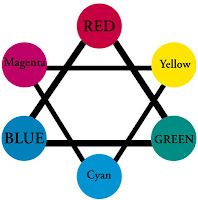
The color wheel provides structure to the discussion of color and gives a reference point that allows us to draw useful conclusions about how colors interact. We start with Blue, Red and Green. In the natural world, these colors exist along the electromagnetic spectrum in a straight line, but we gain great insights into color mixing by plotting these primaries on an equilateral triangle. We also plot the subtractive primaries, Cyan, Magenta and Yellow.
Natural white light contains all colors. When light hits a surface, its energy is absorbed, reflected or bent. A surface painted Black absorbs almost all the light energy that hits the surface. A surface painted White reflects all the light energy back from the surface. A surface painted Yellow absorbs Blue and reflects the Red and Green within the white light. Colors absorb certain wavelengths of energy and reflect other light energies.
Unfortunately, pigments are not perfect primaries. They do not create a perfect Blue, Red or Green. They do not create Magenta, Cyan or Yellow. We only use a color wheel to align colors and we use practical experience to truly understand how they mix with one another.
The Artist's Color Wheel and The Mixing Primaries
Artists are familiar with color wheels showing Red, Yellow and Blue as primaries and Purple, Orange and Green as the secondaries. Secondaries result from the mixture of two primaries, i.e. Red and Yellow make Orange.
This color wheel shifts colors around dramatically. It usually forces color choices such as Cadmium Red, Cadmium Yellow and Ultramarine Blue, all of which use opaque inorganic pigments. These colors, although beautiful in their own right, severely limit color mixing possibilities. The resulting mixtures show lower values and chromas than mixtures with organic pigments.
Mixing Complementary Colors
We filled the color wheel with our color names so we can use it to develop an understanding of mixing possibilities. Mixing from opposite sides of the color wheel will yield black or gray. This is called mixing complements. For example, we see that Phthalo Green and Naphthol Red Light are almost directly opposite one another. The mixing of these two will yield a simple black. For this reason, the mixing set does not include black.
Adding a color's complement reduces the chroma of the mixture. For example, mixing a small amount of Phthalo Green into Naphthol Red Light reduces its intensity, however, it also changes the value of the color. To avoid reducing the chroma of the mixture, use the Neutral Gray of the same value as the color you are trying to mix, or mix a gray from the black produced with your Green and Red mixture with Zinc or Titanium White.
Varying Tinting Strength of Colors
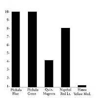
Before we explore the blending possibilities and color relationships, we need to describe the colors in the mixing set. The pigment loads are not balanced as with "student grade" colors. With professional "artist grade" colors, the high tinting colors are much more powerful than lower tinting colors. The highest tinting colors are Phthalo Blue and Phthalo Green. Next are Naphthol Red Light and Quinacridone Magenta. Hansa Yellow Medium has very little tinting strength.
Relative Tinting Strength of Colors
To mix the colors, use this table as a guide. For example, to mix Turquois, mix equal parts of Phthalo Blue and Phthalo Green. To mix Bright Green, mix 1 part Phthalo Green with 9 parts Hansa Yellow Medium.
Tint Strength of Hansa Yellow Medium: In order to balance the much stronger tint strength of Phthalo pigments, try Hansa Yellow Opaque. It provides greater opacity; however, some chroma or intensity may be lost. To achieve some of the more transparent colors, add transparent Gel or Polymer Medium
Achieving Opacity with White
If you have ever been to a paint store and had color mixed, you have seen the process of adding white. Each house paint color, to develop opacity, is mixed with white. Most brands produce three different mixing whites; one very strong white for pastel hues, one middle strength white for middle color values and one fairly weak white for deeper tones of color.
Adding Titanium White to any of your colors will increase the coverage of your color. This is especially true for the more transparent colors. It is also a general rule that the lighter the original value of a color, the less dramatic the value shift when you add Titanium White. Adding Zinc White to transparent colors will not dramatically increase your opacity. It can be used to create subtle, tinted glazes. Keep in mind the resulting mixes will not provide good coverage.
If you choose to increase opacity, but do not want to change your color value, then you must first mix a gray of the same color value. As before, this will reduce your chroma, but will allow you to maintain your balance of light to dark while increasing your opacity.
Mixing Earth Colors
A good deal of painting requires the use of the earth color palette. With high chroma colors, it seems almost impossible to mix colors like Burnt Sienna, Red Oxide or Raw Umber.
Mixing medium greens through lime greens with orange-reds through orange-yellows offers an incredible array of earth colors. When you mix organic pigments, you maintain excellent clarity of color.
Mixing Muted Colors
The color blends achievable with the five mixing primaries, plus the two whites, is enormous. Yet, you may need to reduce the intensity of the color for a more subtle quality. Yellow Ochre offers a warming of colors with a subdued glow. Used with Titanium White to tint colors, Yellow Ochre furnishes an opaque alternative to the bright white used to create the pastel range. Used with Zinc White, Yellow Ochre is transparent enough to create a glazing mixture, or deeper warmer tones within the more brilliant colors. Some artists suggest using Yellow Ochre instead of Hansa Yellow Medium to create a different palette of colors.
Using Artist Acrylic Products
A glass palette offers a great surface for working with acrylic colors. Its smooth, nonporous surface makes mixing colors quite easy.
Acrylics dry by the process of evaporation. As the water releases from the paint, the acrylic polymer spheres come in greater contact with one another and eventually fuse to form a continuous film. To extend the working time of acrylic, you can add GOLDEN Retarder to the paint. GOLDEN Acrylic Glazing Liquid can be added to create glazes and will also keep the paint wet longer. To keep the palette fresh, we recommend lightly misting the colors on the palette with water every few minutes. A plant mister works well.
The acrylic used with all professional artist colors is an emulsion product. It is created by chaining together hundreds of thousands of acrylic molecules (monomers) within a water base. The process to make acrylic compatible with water requires a surfactant. A surfactant acts like a bridge allowing water and acrylic to work together.
This procedure of mixing acrylic with water creates a milky emulsion. While you are working with the paint, the acrylic emulsion is quite white. The wet emulsion "tints" the color; however, when the water evaporates, the acrylic shows its exceptional clarity. This causes a large shift in value in very transparent colors such as Phthalo Blue. The shift in value is not noticeable in colors with light values such as Hansa Yellow Medium so, be aware of the possible shifts in value of acrylic colors. It can be disappointing to mix a color exactly the way you want, and to have it dry to a much deeper color. It is helpful to lay down a little of your transparent color and let it dry to see if it is still the color you desire. Another way to compensate for this value shift is to add a small amount of Zinc White to the color.
To achieve glazes (very thin, transparent films), add Polymer Medium (Gloss) to the color. To reduce gloss, add Matte Medium.
GOLDEN produces over 20 Gel Mediums to create a tremendous range of textures, finishes and working properties for acrylic paint. Because of their unusual strength, most colors can be diluted substantially with Gels or Mediums and still retain much of their color strength.
Acrylics clean with soap and water. Keep tools wet to assist cleaning. If paints dry on the palette, simply run a wet sponge over the surface and wait about 1 minute. The acrylic will easily peel off. Avoid getting paint on clothing. It will hold quite well!
About GOLDEN
At Golden Artist Colors, we are involved in exploring new technologies for the professional artist. This has inevitably led us to many of the newly developed pigments that have been made available to artists during the later part of this century. Some, like our Pyrrole Red, have been around for less than a decade.
We are very proud to have been the first to provide many of these unique and very lightfast pigments to the professional artist, including Quinacridone Gold, Burnt Orange, various shades of Phthalo Blue and Phthtalo Green, Nickel Azo Colors, Titanates of Cobalts, and the concentrated Cadmiums.
Additionally, through our formulating advancements we have been able to stabilize Zinc White, which previously had not been available in acrylic paint. We have also provided a near perfect match for the fugitive, but beautiful, Alizarin Crimson, with our Quinacridone Crimson. The entire family of Interference Colors was also introduced for the first time to artists by our company.
Acrylics continue to be the fastest growing segment of the fine art market. Through our custom work with artists, museums and conservators all over the world, we have assembled a formidable range of color choices, and continue to work to develop new and unique colors for our customers.
Exercise 1
Identifying the various qualities of color
Step 1: Locate Quinacridone Magenta, Phthalo Blue (Green Shade) and Hansa Yellow Medium on the color chart. These colors are the mixing primaries for this guide.
Step 2: Find C.P. Cadmium Red Dark and Red Oxide. Observe the difference between the colors' chroma. The Cadmium Red has a much greater chroma, or saturation, than Red Oxide.
Step 3: Notice the Cobalt Green and Cobalt Titanate Green. Both have nearly the same hue and chroma, yet the Cobalt Titanate Green is much lighter in value than the Cobalt Green. Find the Neutral Grays on the bottom of the color chart, and try to match the value appropriate Neutral Gray to each Green.
Exercise 2
Understanding the difference between Titanium White and Zinc White
Step 1: With a palette knife, apply a thick, opaque stroke of each color to show its masstone. Turn the knife on its edge and scrape the color to show its undertone.
Step 2: Apply some Titanium White to a card and mix a color so that the resulting mixture is graduated from a very light tint to its original hue.
Step 3: Repeat the same mixtures using Zinc White. For future reference it is helpful to label your examples and take notes.
Exercise 3
Using the Mixing Primaries
Before exploring all the mixing possibilities, first investigate mixing using the primary colors, Phthalo Blue (Green Shade), Quinacridone Magenta and Hansa Yellow Medium. To create colors along the wheel between these primaries use the following tinting ratios.
Turquois - 1 part Phthalo Blue G/S / 1 part Phthalo Green B/S
Light Red - 1 part Quinacridone Magenta / 5 parts Hansa Yellow Medium
Permanent Green Light - 1 part Phthalo Blue G/S / 10 parts Hansa Yellow Medium
Exercise 4
Mixing a Full Range of Earth Colors with Organic Pigments
Step 1: Mix 10 parts Hansa Yellow Medium with 1 part Phthalo Green (Blue Shade) to create a bright green color. Lightly spray with water and set aside.
Step 2: Mix 5 parts Hansa Yellow Medium with 1 part Quinacridone Magenta to create a bright red color.
Step 3: Take a small, equal amount from each mixture and blend together. Record the results by brushing it on a white board.
Step 4: Mix 2 parts of the bright green with 1 part of the bright red. Record results.
Step 5: Mix 4 parts of the bright green with 1 part of the bright red. Record results.
Step 6: Try the same mixtures as above but first mix a bright, lime green using mostly Hansa Yellow Medium and a very small amount of Phthalo Green B/S. Record this green as it is a major mixing color for producing a variety of unique colors from Green Gold hue through Nickel Azo Yellow hue and Quinacridone Gold hue.
Exercise 5
Mixing to achieve black and gray using Phthalo Blue G/S, Quinacridone Magenta and Hansa Yellow Medium
Step 1: Mix 1 part of Phthalo Blue (Green Shade) with 2 parts Quinacridone Magenta. The mixture will be correct when you perceive it to be the deepest blue without being described as purple. This is an approximate primary blue.
Step 2: Mix 2 parts primary blue with 1 part Hansa Yellow Medium.
Step 3: Tint a small portion of the resulting color with Titanium White.
Mixing to achieve black and gray with Phthalo Green B/S and Naphthol Red Light
Step 1: Mix 1 part Phthalo Green (Blue Shade) with 2 parts Naphthol Red Light.
Step 2: Tint a small portion of the resulting color with Titanium White.
Mixing to achieve black and gray with Quinacridone Magenta, Hansa Yellow Medium and Phthalo Green B/S
Step 1: Mix Quinacridone Magenta with a small amount of Hansa Yellow Medium. The resulting mixture should look like a bright Quinacridone Crimson hue.
Step 2: Mix 1 part Phthalo Green (Blue Shade) with 2 parts of the above crimson hue.
Step 3: Tint a small portion of the resulting color with Titanium White.
Label all your cards for future reference.

.jpg)
.jpg)