Showing posts with label my notes. Show all posts

Friday, March 30, 2012

Color Evaluator II - #5002

I was reading a post in a portrait artist forum and some people are using ( red acetate) red color glasses to see tones more clearly and to highlight drawing mistakes.

They say when you look through the lens to take note which areas stand out as the lightest on the model and then check to see if those areas are standing out as lightest in your work.

Looks like a useful and inexpensive tool.  I’m thinking about getting a pair only $7.99 at Cottagemills.com

http://www.cottagemills.com/default/colorevaluator.html

Peter Paul Rubens PDF Files on Color Theory


There is a wealth of information on line in free PDF files, you just have to know where to find them. Here is a great PDF file I found on Peter Paul Rubens about his color theory :

Peter Paul Rubens PDF on color theory


http://digitool.Library.McGill.CA:80/R/-?func=dbin-jump-full&object_id=28850&silo_library=GEN01

Tuesday, March 27, 2012

100 Lectures for Art Enthusiasts at Online College.org

100 Awesome Lectures for Art Enthusiasts

Whether you’re studying art, or are just interested in learning more about it, there’s plenty of information to be found online. Some of the best resources for learning about art online are lectures, many of them offered by top universities like MIT, Princeton, and Harvard. Here, we’ll take a look at 100 incredible lectures for your art education.


http://www.onlinecollege.org/2009/09/07/100-awesome-lectures-for-art-enthusiasts/

Thursday, December 29, 2011

New Year's Art Resolutions for 2012

With the New Year right around the corner, this is the time I usually start soul searching for what I want, what I need, what I can do without and how to get it all done.

That’s right its resolution time and I always take it serious, aiming for self-improvement and happiness, while remaining clear- minded and realistic, making sure not to fall into that trap of setting the New Year’s resolution bar too high, only to fall short.... like so many seem to do.

I usually start out by making a list of all my grievances for the year, the type of things that I actually have some kind of control over, and can change with a little hard work and discipline. Apparently this has been a tough year as I’m already on my third page of gripes with no end in site. Guess I got my work cut out for me in 2012.

But with regards to my art for 2012, I would like to focus on the one thing that has frustrated me the most this year, rendering the human figure. Still enamored from my trip to Italy, the Italian masters have opened my eyes to artistic spiritually at its finest, with the human figure as a key component for expressing the passion in ones heart, nothing would please me more then to be able to capture that spirit in my work.

So as I was saying, it looks like I have my work cut out for me for 2012 !

Happy painting and  New Year !

Tuesday, November 1, 2011

Just a few things I need to ask myself, while I'm oil painting.

Why am I painting this?

What do I like about it?

What am I trying to say with this painting?

What story am I trying to tell?

What emotions am I trying to stir up?

Am I stepping back often enough to see what the heck I'm doing?

Am I painting the light?

Am I paint all the reflective light?

Am I painting the shadows?

How is the perspective?

Are the values correct?

Is the composition pleasing?

Does the painting read well?

Have I defined a focal point?

Is the color rich enough in the focal point?

Are my contrasts strong at the focal point?

Am I working the contrasts of hard and soft edges?

Am I working the contrasts of hot and cold color?

Am I working the contrasts of thick and thin paint?

Am I working the contrasts of opposite colors?

Am I working the contrasts of darks and lights?

Flip the painting upside down and take a good look at it, is it still balanced?

Look at it in the mirror, does it still look good or is something off?

Is my palette getting too muddy?

Are my brushes over loaded with paint?

Did I take this painting as far as I could today?

Should I stop before you mess it up?

Why the heck am I painting this again?

Sunday, February 6, 2011

Primary Color Mixing

One of the problems lies with the old conception of the Color wheel. When asked what the primary colors are, one will usually answer, “red, yellow and blue.” However, not any red yellow and blue is in fact a primary Color. Cadmium red, for instance, contains a lot of yellow and if mixed with blue, will make a dirty purple. Similarly, French ultramarine contains a lot of violet, and if mixed with yellow, would result in a muddy green.


In terms of printing ink, the primary colors are yellow, magenta and cyan. In terms of oil paint, these colors are not similarly labeled, but cadmium yellow (pale), permanent rose and phthalo blue are close. These colors are the closest approximation one can get to a true primary Color in oil paint, and will usually produce clean mixes.


Darkening a color might be a challenge for the beginner, and the automatic reaction might be to mix the color with black. In fact, the best way to darken a color is by the introduction of its complimentary. A complimentary color is the opposing color to a particular color on the color wheel.

Red, for instance, is the complimentary to green; violet, is the complimentary to yellow, and so forth. From this, one can avoid black altogether, for in fact, black will often deaden a color and it is best omitted from the artist’s palette if the intention is to create clean color mixes.

Friday, February 4, 2011

A simple Value Scale shows figure-ground relationships


Figure-Ground is the condition in which backgrounds tone or hue changes the visual impact of the figure resting on it. The same hue or value appears to be a different depending upon the contrast of tone or hue of the background upon which it is placed. Conversely, two different tones or hues appear to be the same when placed on contrasting grounds. Each will have an impact on how believable your art will be perceived by the viewer. Most people have difficulty perceiving “figure-ground” relationships. When the same medium toned figure is placed on varied light and dark backgrounds, it will be perceived to be as a different value.


Example: When a medium gray is placed on a near black background, the mid-gray tone appears very light. When the same gray tone is placed on a near white background, it is perceived to be very dark. But when a mid gray tone is placed on a similar value background, the contrast is minimal. Note how the same mid-tone value patch looks different when placed on backgrounds of contrasting values.

Tuesday, January 25, 2011

Posemaniacs


What’s this training for?


   This is a  thirty second drawing tool to support gesture drawing. You will improve in recognizing aspects of figures in a short amount of time, and be able to draw accurately with minimum lines. Drawing a large number of sketches in a small amount of time may be good exercise especially for beginner. This training will easily become your daily routine.

Procedure

Get ready in front of the screen with a pencil and a paper. Press the start button. The models shown will change every 30 seconds. Your skill will surely improve if you do this training every night and day, with 2 sets of 5 minutes(10 poses).

Here is the link to the Posemaniacs Page.

Sunday, January 2, 2011

Oil Painting Notes, Tonal Relationships

The vanes of the windmill have been painted with great attention to tonal relationships. The upraised vane is light against dark (L/D). The one opposite that is dark against light (D/L).. The other two are subordinated. One is dark against dark (D/D)., and the other is light against light (L/L).. Each vane of the windmill represents one of the four possible tonal arrangements.The resulting effect marries the subject to the background in a way that both separates it and embeds it. In tonal terms.

Notes from International Artist Magazine by James Gurney

Sunday, December 19, 2010

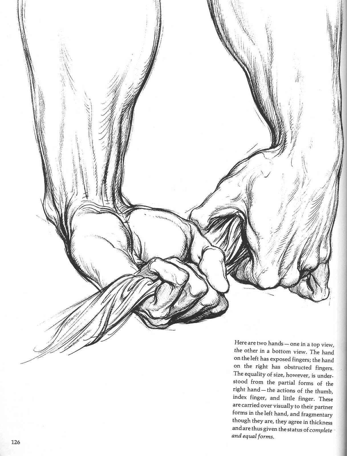
Oil Painting Notes, The Hand as a Block Form

Anatomy Notes on the Hands

Anatomy is something a figure artist should study with a vengeance. There’s just no way around it, unless your an abstract figure artist. In that case I don’t know if it really matters much but in my case I can tell I have to put my nose back into an anatomy book. I think life figure drawing classes start up again in January so I’ll be sure to sign up for them as well. For now I want to post some anatomy notes as this will help me with my studies. I think I’ll start with the hands.


Thursday, December 9, 2010

Oil Painting Notes on Composition


The Windmill Principle


The four conditions of tone in relation to surroundings. At (1) is light against light, at (2) light against dark; at (3) dark against dark; and at (4) dark against light. Note too that the subordinate edges at (1) and (3) are blurred a little more.

The resulting effect marries the subject to the background in a way that both separates it and embeds it.