Sunday, February 27, 2011

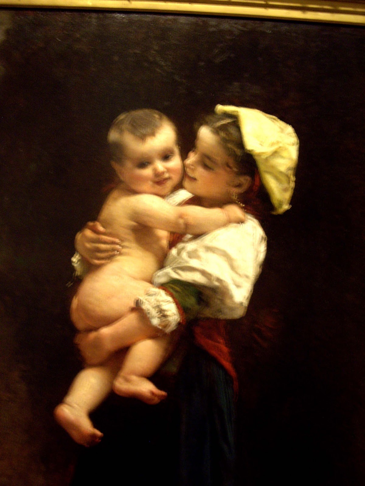
The Museum of Fine Arts in St Petersburg Florida

The Museum of Fine Arts of St. Petersburg, Florida has the only comprehensive art collection extending from antiquity to the present on the Florida west coast.

It’s like a little New York Met. and I have to stop in every time I visit my dad in Clearwater Fl.


Photography is permitted for the permanent collection, so I took the liberty of snapping a few shots.


Friday, February 11, 2011

Baseball Glove Oil Painting

 I worked on this painting some more in class on Wednesday night. Ray Horner /jedi master suggested I move away from the dark side and paint a little bit lighter. So I got out of my dark comfort zone and started to lighten it up a little bit.


It was the general consensus of the class that I put down the brushes, sign it and call it a day. But I want to think about it for a while before I sign it. Because the house rules are “ After you sign it, you can’t keep working on it.”                      

Date Night at the Met

Editorial assistant Nadja Hansen expounds on why the Met is a great place for a date.
http://www.metmuseum.org/connections/date_night/#/Complete/


Monday, February 7, 2011

" Joni Mitchell " Famous people who paint

Think of Joni Mitchell and think primarily of her incredible career as a singer, songwriter, musical innovand trailblazer. Much has been written and discussed of her musical career - much less so of her life as a painter. She created the artwork for each of her albums, and in 2000 described herself as a "painter derailed by circumstance." A blunt critic of the music industry, Mitchell stopped recording over the last several years, focusing more attention on painting, but in 2007 she released Shine her first album of new songs in nine years.


Sunday, February 6, 2011

Baseball glove oil painting


I found some time to work on this painting yesterday, and got up early this morning to correct the shadow under the foreground base ball. I moved the ball from one side of the glove to the other for a better composition, but I just couldn’t get the shadow right. I was making it to big and the ball looked like it was floating in the air. After beating up the canvas for a while I decided take a picture of it and work it out in Photoshop. I’ve done this before and it can be a real time and paint saver.

I’m thinking about putting in a few baseball bats to add interest to the composition, but I don’t want to over do it. I’ll just leave it alone for now. I want to bring it back to class Wednesday for a critique.

Primary Color Mixing

One of the problems lies with the old conception of the Color wheel. When asked what the primary colors are, one will usually answer, “red, yellow and blue.” However, not any red yellow and blue is in fact a primary Color. Cadmium red, for instance, contains a lot of yellow and if mixed with blue, will make a dirty purple. Similarly, French ultramarine contains a lot of violet, and if mixed with yellow, would result in a muddy green.


In terms of printing ink, the primary colors are yellow, magenta and cyan. In terms of oil paint, these colors are not similarly labeled, but cadmium yellow (pale), permanent rose and phthalo blue are close. These colors are the closest approximation one can get to a true primary Color in oil paint, and will usually produce clean mixes.


Darkening a color might be a challenge for the beginner, and the automatic reaction might be to mix the color with black. In fact, the best way to darken a color is by the introduction of its complimentary. A complimentary color is the opposing color to a particular color on the color wheel.

Red, for instance, is the complimentary to green; violet, is the complimentary to yellow, and so forth. From this, one can avoid black altogether, for in fact, black will often deaden a color and it is best omitted from the artist’s palette if the intention is to create clean color mixes.

Friday, February 4, 2011

A simple Value Scale shows figure-ground relationships


Figure-Ground is the condition in which backgrounds tone or hue changes the visual impact of the figure resting on it. The same hue or value appears to be a different depending upon the contrast of tone or hue of the background upon which it is placed. Conversely, two different tones or hues appear to be the same when placed on contrasting grounds. Each will have an impact on how believable your art will be perceived by the viewer. Most people have difficulty perceiving “figure-ground” relationships. When the same medium toned figure is placed on varied light and dark backgrounds, it will be perceived to be as a different value.


Example: When a medium gray is placed on a near black background, the mid-gray tone appears very light. When the same gray tone is placed on a near white background, it is perceived to be very dark. But when a mid gray tone is placed on a similar value background, the contrast is minimal. Note how the same mid-tone value patch looks different when placed on backgrounds of contrasting values.

Wednesday, February 2, 2011

Wednesday night art class


Here’s a study in progress of a few baseball gloves that a student had in the trunk of her car. I like painting spontaneous stuff because it makes you think. You never know what’s going to come up in art class.

We started with a small thumb nail sketch to develop the composition, then our instructor Ray Horner told us to start with a blue under painting and work out from there, allowing the under painting to show through.

I have to say it helped a lot by setting up a good mid tone to work from. Pulling out lights in the beginning with a rag / brush and adding dark’s as needed all along blending into the blue and shaping the painting.

If you notice I moved the lower baseball to the other side of the black glove because I thought it gave for a better composition.

I took some reference pictures of this still life in class and I would really like to bring the painting to a finish. If I can find the time this week I may work on it at home, but with " Superbowl Sunday " coming up I doubt it.


Tuesday, January 25, 2011

Posemaniacs


What’s this training for?


   This is a  thirty second drawing tool to support gesture drawing. You will improve in recognizing aspects of figures in a short amount of time, and be able to draw accurately with minimum lines. Drawing a large number of sketches in a small amount of time may be good exercise especially for beginner. This training will easily become your daily routine.

Procedure

Get ready in front of the screen with a pencil and a paper. Press the start button. The models shown will change every 30 seconds. Your skill will surely improve if you do this training every night and day, with 2 sets of 5 minutes(10 poses).

Here is the link to the Posemaniacs Page.

Sunday, January 23, 2011

Jose De Ribera Study

As I continue with my drawing practice, I decided to do a charcoal study of  Jose de Ribera's oil painting Martyrdom of Saint Philip. 


Saturday, January 22, 2011

Art Quote of the Day by , Rebecca Guay

Words of wisdom by Rebecca Guay


“I have always believed that life in the pursuit of art is never easy. It challenges the soul , makes you resilient to rejection, pushes your limits and offers no guarantees whatsoever. But after all is said and done , what serious pursuit in life is an easy path? Meanwhile the journey is quite glamorous and one filled with grandeur and limitless possibilities that come with creating a completely new and unique object of beauty to offer to the world.”

Monday, January 17, 2011

Cast Drawing Study, Iron Fence

    I remember getting this piece of old iron fencing at the Lambertville Flea Market many years ago. I liked the scrolling shape of it....just never really knew what to do with it...... till now. It makes for a good cast study and it gives off crazy shadows. I may incorporate it into a painting in the future.


Boston KS Pencil Sharpener

My electric pencil sharpener worked good for about a month, then it quit on me after I tried to sharpen a few pastel pencils. Good thing I didn't chuck out my good old Boston KS American classic. This thing will sharpen nails !!


Cast Drawing Practice

I found this old bell in the basement and thought it would work for a quick cast study.

Sunday, January 16, 2011

Practice,Practice,Practice your Drawing,Drawing,Drawing !!!

Time to brush up on the drawing skills. I’ve been spending too much time correcting drawing errors in my paintings, so it’s clear that I have to get back to the sketch book to pay my dues.

 I reorganized my art studio and set up a little corner for cast sketching. I’ve rummaged through the basement and attic for whatever casts I could find. I also set up an adjustable light stand.


I’ve been searching around on line for anatomy cast. They can get a little bit pricy but they are a necessary study tool for accurate seeing and drawing. Here are a few of the sites I’ve been looking at that have quality casts.
 AnatomyTools.com

The Guist Gallery


Monday, January 10, 2011

Art lecture by Mel Leipzig: The Changing Face of Reality/Realism in Art


Thursday night at the at the Arts Guild of New Jersey, Mel Leipzig shared his wisdom on the philosophical and sociological implications of the world portrayed in a work of art and the aesthetic vision of the artist. From ancient Greek and Renaissance artists to modern American artists, realism is never easy to categorize from the surface quality alone. In his presentation, Mel opened our eyes to the world behind the artwork.

Wednesday, January 5, 2011

Vogue Series 10 oil painting in progress

Vogue Series 10


I still have to work on the hand , face and a few other things but I thought I'd post my progress so far on # 10

Tuesday, January 4, 2011

Art Quote of the Day

"In order to be open to creativity, one must have the capacity for constructive use of solitude. One must overcome the fear of being alone."


— Rollo May

Sunday, January 2, 2011

Oil Painting Notes, Tonal Relationships

The vanes of the windmill have been painted with great attention to tonal relationships. The upraised vane is light against dark (L/D). The one opposite that is dark against light (D/L).. The other two are subordinated. One is dark against dark (D/D)., and the other is light against light (L/L).. Each vane of the windmill represents one of the four possible tonal arrangements.The resulting effect marries the subject to the background in a way that both separates it and embeds it. In tonal terms.

Notes from International Artist Magazine by James Gurney