.jpg) I took this picture a few years ago at Newark’s Liberty International Airport. I liked the composition of the picture and the movement of all the employees getting the plane ready for flight. I wanted to keep that energy so painted loosely using poppy oil as a medium this time. There are still a few more things I would like to try to do with this painting to suggest movement so I think I’ll let it dry for now a come back to it when I have a clear idea of how to get the affect I’m looking for.
I took this picture a few years ago at Newark’s Liberty International Airport. I liked the composition of the picture and the movement of all the employees getting the plane ready for flight. I wanted to keep that energy so painted loosely using poppy oil as a medium this time. There are still a few more things I would like to try to do with this painting to suggest movement so I think I’ll let it dry for now a come back to it when I have a clear idea of how to get the affect I’m looking for.Saturday, December 19, 2009
Newark Liberty International Airport Oil Painting
I took this picture a few years ago at Newark’s Liberty International Airport. I liked the composition of the picture and the movement of all the employees getting the plane ready for flight. I wanted to keep that energy so painted loosely using poppy oil as a medium this time. There are still a few more things I would like to try to do with this painting to suggest movement so I think I’ll let it dry for now a come back to it when I have a clear idea of how to get the affect I’m looking for.Sunday, December 6, 2009
smart blur filter in Photoshop
 One last pass through the smart blur filter and I think thats it. The smart blur filter cleans things up and gives the piece a smooth finished look without removing to much detail.

Saturday, December 5, 2009

photoshop liquify tool
 I added a tear in her eye using the paint brush tool and the liquify tool to get those swirling effects in the back round and on the wings .
painting in photoshop
 I adjusted the brightness and contrast of the whole picture to get it to punch out more, while adding variations to the blocked in colors to give more interest and dimension.


Sketching into Photoshop
 Inspired by a conversation with a friend last night who likes to sketch fairies, I decided to give one a try. Although she likes to sketch her fairies deceased.....I just couldn't find it in myself to kill one of these things so I decided to make mine a little sad instead. lol....
I started out with a loose sketch with vine charcoal on toned paper. When the drawing was complete I took a quick digital picture and put the image onto Photoshop.
Saturday, November 28, 2009
Glass palette with grayscale
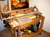
I haven’t really been in the mood to paint this week, so I figured a few upgrades to the work station just might be the thing to get me going next week. I’ve been wanting a glass palette with a grayscale built in for some time now so I decided to make one. I got some scrap wood that I had left over from another project {3/4 plywood 12" x15"and some 1" strips of oak for the sides} , a 11"x14" glass from an old picture in the attic, a sheet of gray palette paper and a grayscale to go under the glass. ( I cut the grayscale from the back of a gray paper palette I ordered on line). Well there you have it a simple and inexpensive glass palette made from left over materials. I promise it won’t be this clean next week. 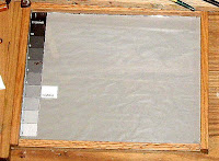


Monday, November 23, 2009
Art Quote of the Day
There may be a great fire in our hearts, yet no one ever comes to warm himself at it, and the passers-by see only a wisp of smoke.
Vincent Van Gogh
Vincent Van Gogh
Friday, November 13, 2009
Van Gogh by Pierre Cabanne
 I would love to paint like Van Gogh, all that thick paint with loose brush strokes. The man was brilliant. The funny thing is I didn’t really know much about him. Well accept that he cut his ear off for some strange reason..... and then there’s that old Don Mclean tune Starry Starry Night. Other then that I couldn’t tell you much about the guy, So I got a few books and started reading about the man his life and his passion for art. I just finished the first book by Pierre Cabanne and I’m now looking forward to going back to the Met. to observe his work with some insight into his thoughts and struggles.
Monday, November 9, 2009
a keener eye for observation
 I’m still working on this guy on his horse, adding more detail while correcting some drawing errors as I go along. I’ve noticed that the more I analyze the reference picture the more I ‘m amazed at Frank Frazetta’s imagination and attention to detail. There is much more detail in his work then I initially noticed when I started this painting. If I come out of this painting learning anything it will be a keener eye for observation.
Sunday, November 8, 2009
Personal still life’s.
 Ray Horner suggested painting his shirt, as he hung it up ever so artistically on the corner of a green louvered door in class. Personal items make for good subject matter and it’s an intimate way for an artist to put a part of his life and soul onto the canvas. So as I took on the challenge of painting all those fabric folds of Rays shirt, I started thinking about the many personal items of my own that I’ve been meaning to paint but just haven’t gotten around to. Hopefully I can keep up the momentum and continue on with some more personal still life’s.
Saturday, October 17, 2009
Monday, October 12, 2009
Gamblin Oil Painting Medium Notes
Alkali Refined Linseed Oil - Processed from flax seeds. This linseed is the purest and lightest industrially produced variety.
Cold Pressed Linseed Oil - Made from the first pressing of flax seeds without heat or chemicals of any kind.
Cold Wax - Made from natural white unbleached beeswax. Mix directly into colors. Cold Wax creates an ultra-thick, matte impasto. For greater shine and flexibility mix with Galkyd medium.
"G-Gel" - Made from alkyd resin, Galkyd Gel is a colorless oil color additive that accelerates the drying rate of oil colors and enables artists to create thick transparent paintings with a moderate sheen.
Galkyd Painting Medium - Alkyd based resin painting medium that thins oil paints and maintains a strong flexible paint film. Galkyd speeds the drying rate and is excellent for glazing providing an enamel like finish. Thins with Turpenoid.
Galkyd Painting Medium Lite No.2 - This low viscosity alkyd resin painting medium is a good replacement for traditional damar/ linseed oil/ turpentine combination mediums. It will give you longer working time and it will maintain your brush strokes. Thins with Turpenoid.
Galkyd Slow Drying Medium - Especially formulated to thin oil colors and give painters extended working time. To use mix equal portions of medium with oil colors to paint wet for at least a day. Since this product should not be diluted you may want to purchase the larger size.
Gamsol - Quality solvent and medium and for general oil painting. Gamsol is also an excellent studio and brush cleaner.
Gamvar - Conservation quality varnish for oil, acrylic and alkyd paintings. This resin varnish may be removed with a mild solvent and contains a UV stabilizer. Developed in association with the National Gallery of Art. Package makes enough varnish to cover 80 sq ft.
Neo-Meglip - When mixed into oil colors Neo-Meglip makes them richer and deeper and finished paintings have a luminous glow! Neo-Meglip will not darken or crack over time. Thins with mineral spirits, turpentine or turpentine substitute.
Oil Painting Ground - For strong, bright foundations of oil paintings. Requires only 2 coats. Formulated from alkyd resin, titanium dioxide and barium sulfate. Stiffer than traditional gesso.
Poppy Oil - Poppy Oil’s slow drying time may be useful for painters using "wet into wet" techniques. Adding 10% by volume poppy oil slows down the drying time of Gamblin Galkyd Painting Mediums.
Stand Oil - Vacuum bodied heavy oil which can be used in painting and glazing mediums. Dries to an enamel like finish.
Wax Pastilles - Small beads of naturally white unbleached beeswax.
Charvin Oil Painting Medium Notes
Carthame Oil (Purified Safflower Oil) - Poppy oil has been used in paint formulations for centuries. A relatively new alternative has been Safflower oil. Yes this is a non-acid vegetable oil. It is a useful substitute for artists who can't get Poppy oil. It tends to be slightly more yellow than poppy. You can also use this oil to make colors more fluid and brilliant while painting without altering the shade while drying.
Clarified Linseed Oil - Linseed Oil is extracted from the seeds of the flax plant, which are pressed and lighty toasted. Linseed Oil creates a very good paint film which is hard, resistant and flexible. Linseed Oil also reacts well with additives and is by far the easiest oil to make oil colors with when combined with pigment. The disadvantage is that it will slightly yellow. One strange phenomenon of Linseed Oil is that in the dark the oil darkens quite a bit but when exposed to sunlight it will lighten.
Clarified Poppy Seed Oil - This is an oil made from the seeds of the black poppy. When mixed into color it produces a hard film that is resistant and flexible, although not as quick drying as Linseed Oil. However, it has very little color and therefore has very little tendency to yellow with age. Some pigments are very fragile and Poppy Oil is non acidic so it doesn't attack the chemical nature of these pigments. For these reasons it is mixed with Linseed Oil in a guarded formulation which is generally said to be 50/50% ratio in the creation of Charvin Oil Colors. Poppy oil is slower drying than Linseed Oil so care should be taken not to use only Poppy Oil as the drying rate will be very slow.
Siccative of Courtai - This drying agent should never exceed in volume greater than 5% as compared to what you are mixing it into.
Walnut Oil - This is the palest of the oils used in paint manufacturing. It too has a similar effect on slowing the drying rate as compared to using linseed. It is made from nuts and anyone allergic to nuts should avoid exposure to this product. For this reason it is not suggested for classroom painting.
Sunday, October 11, 2009
Notes on Oil Painting Varnish
It is very important to varnish your paintings. They protect your finished art against atmospheric acids, dust and decay. For a varnish to be acceptable it must be reversible. All of Charvin varnishes are reversible, meaning they can be removed without harming the paint layer below. In all cases this should be done by an experienced restorer.
Dammar Varnish Gloss - This final varnish is made of a base of dammar gum. It gives painting a bright and glossy finish.
Dammar Varnish Matte (Satin) - A varnish made with a prepared blend to give paintings a bright appearance but without the glossy characteristics of damar.
Gloss Painting Varnish - This is a classic varnish based on newly developed synthetic resins. It is totally colorless and fast drying. It creates a resistant film that is slightly more difficult to remove. It must be dried to perfectly dried paintings.
Matte Painting Varnish - A synthetic based varnish that is totally colorless. Creates a very resistant film and is fast drying. Apply it to a very dry painting.
Retouching Varnish - This pre-mix by Charvin is a tried and true formula. Retouching varnish is used to even out the finish of the painting as some areas may be glossy while other may appear matte. This will disturb the painter's perception of the pictorial substance that he is working on. It also allows painters to see paint layers more clearly then if they were left matte. Finally if you can use Retouching Varnish to speed the curing of the finished painting.
I could have used liquin but, I like this method better
 At this stage I’ve decided to add a mixture of Walnut oil, Dammar varnish and Turpenoid to the paints. I could have used liquin but I like this method better because I feel I have more control over the paint for movement, transparency and fine details. With this mixture the painting will remain open and workable for a few days, this allows me time to fuss with the details. I have several paintings going on right now and this also allows me the freedom to move back and forth between them. If I get stuck on one I’ll just put it away and start on another.
Saturday, October 10, 2009
Oil painting, backround colors
 Using the same palette of mars black, burnt sienna, gold ocher and titanium white. I started working on the darkest dark’s of the figure and the light grays of the back round. At the same time I’ve been trying to tighten up the drawing as best I can.
Friday, October 2, 2009
American Masters Series on PBS
 I was lucky to catch the Jose Clemente Orozco and Annie Leibovitz documentaries on the PBS channel. Great stuff, They are a part of the PBS American Masters Series . If you go to the PBS page you can check the listing times in you
  area.
area.
Sunday, September 20, 2009
Mars black with burnt sienna
 I got up early today to work on this one but it turned out to be such a nice day that I had to get out of the house, so I just filled in some darker colors with mars black mixed with burnt sienna, gold ochre and white. Nothing fancy at this point just filling in color and reworking the drawing a little.
Wednesday, September 16, 2009
Frank Frazetts practice in progress # 2
 I enjoyed drawing the first Frank Frazetta so much I've decided to start another one. Hopefully I'll start to put the color in soon.
Frank Frazetta in progress
 I’ve been working on this one all day now, I sketched it freehand with Burnt sienna and raw umber.


Tuesday, September 15, 2009
What inspires a child to oil paint ?
I was wondering just what kind of artwork I was exposed too as a child, that would have inspired my passion for oil painting today. Not an easy question to answer, because I have absolutely no memory of a teacher’s encouragement regarding art at all, and while encouraging in there own way my parents weren’t artsy people. We never went to art galleries or art museums and the artwork in our home over the years was store bought and drab. So not a lot of inspiration there.
Then what was it? What was that inspiring element of my youth that opened up my heart and fires my passion for oil paint today? After some thought the answer became clear. It was Church and Frank Frazetta! I know an unlikely combination, but let me explain. While going to Sunday Mass may have been a chore for me growing up, once at church I can remember being captivated by the dramatic story telling of the frescos. I never herd a word the priest said. I would just stare at the ceiling and walls for an hour. The passion of Christ, his ascension into heaven, angels, sinners and saints it was all amazing.
Then what was it? What was that inspiring element of my youth that opened up my heart and fires my passion for oil paint today? After some thought the answer became clear. It was Church and Frank Frazetta! I know an unlikely combination, but let me explain. While going to Sunday Mass may have been a chore for me growing up, once at church I can remember being captivated by the dramatic story telling of the frescos. I never herd a word the priest said. I would just stare at the ceiling and walls for an hour. The passion of Christ, his ascension into heaven, angels, sinners and saints it was all amazing.
Well then....now that I think about it, every week my parents took me to the best art gallery in town! Thanks mom and dad! So yes... without a doubt I can say that going to church was the key factor that opened up my heart to the world of art. But what was it that inspired me enough to grab a paint brush and try to paint something.
Well ....we all read comic books growing up, but I could take them or leave them.... for me it was just something to do. My brother on the other hand had an awful lot of comic books. I would say he had thousands of them. But that was his thing not mine. I don’t think I ever read any of his comics and I’m not so sure he would have let me either. But one day I noticed he had some framed Frank Frazetta prints hanging in his room and I don’t think I’ve looked at art the same way since. Vikings in battle with axes in hand riding enormous horses, giant snakes, crazy monsters, beautiful woman with lions and leopards. I had never seen anything like them before, what imagination they were mesmerizing. I would stare at them with the desire to create my own.....I just didn’t know how.
I can remember doing a lot of pencil drawings of snakes, dragons, space ships and monsters what ever was in my head I would try to draw it, but it was difficult with no guidance and it wasn’t long before it became discouraging. Then came high school, girls, beer, cars and it wasn’t long before art went right out the window.
Not learning how to oil paint has always been one of my biggest regrets and for some reason about four years ago I decided to make up for lost time by learning as much as I can about the process. I know I can do this, it does not come easy for me and every painting is a challenge. But my mind is set.
So as I stare at a Frank Frazetta painting on line my heart beats a little faster and the lost child in me says he wants take a another shot at it.
Saturday, August 29, 2009
Muddy Palette
 I think I’ll call it quits for today. The paint is starting to dry and its become difficult to blend the colors on the canvas. When to colors start getting muddy, you know its time to back off. I’ll stare at it now for a day or so and see what I like and don’t like about it. Then I’ll come back at it with a clean palette and hopefully finish it up.
palette knife to make a more painterly painting
 I have added more detail in some areas and started using a palette knife to make it a more painterly painting. Although I am pleased with my progress there are still a few issues with the shape of the armoire that I will have to address. I can remember almost having a nervous break down getting this thing up the stairs, I guess it’s not through beating me up yet.
Painting is Mandatory When its Raining
 Saturday morning and it’s raining ....again. And my motto is "painting is mandatory when its raining and sunny days are for getting the heck out of the house." I ‘ve been working on this now for a few hours. I’m trying to bring some depth and detail into it.
Friday, August 28, 2009
Oil painting, blocking in of the shapes
 I started to roughly block in the shapes with color using the same limited palette as the last painting. So far I mixed all the colors on the canvas to speed things up but more likely because my foot still hurts and I didn't feel like running down the stairs again to get my palette knife.
Burnt Umber and Burnt Sienna wash
 Sketching with a wash of Burnt Umber and Burnt Sienna, I just about have the composition work out.
Oil Painting the House
 I’ve decided to start another oil painting, this one will be of the upstairs master bedroom. I have to admit that I’m intrigued by Andrew Wyeth’s idea of documenting old homes and there past way of life through his art. It kind of lets the home live on long after its gone and you can never go back . Like an old photo but more intimate more personal. After my last painting of the spare bedroom I’ve decided to do the same with the rest of my home, document it through my paintings. I’m always looking for interesting things to paint and this house seems to be full of them. I just have to bring the easel from room to room without making a mess.
Andrew Wyeth inspiration,day# 3
 I’m still working on this one.....I might just let it dry and look into those amazing dry brush techniques of Andrew Wyeth, although it may be difficult with oil on canvas. I used the palette knife to highlight some of the lightest lights and I am pleased with the results. I may just decide to let this one go as is. I’ll see how I feel about it in a few days.
Thursday, August 27, 2009
Andrew Wyeth book review
 I have been reading the Andrew Wyeth autobiography. In the book the artist explains in his own words the story behind his paintings. Painting with words he allows the viewer to see his paintings and enjoy them in a whole new light. The book has 133 tempera, dry brush and watercolor paintings and five pencil sketches. The amount of detail that he gets from his dry brush techniques are mind boggling .
Andrew Wyeth inspiration in progress,Day #2
 This is my second day of working on this painting, my palette is Chromatic Black, Raw Sienna, Sap Green, Burnt Sienna, Alizarin Permanent and Titanium White.
Wednesday, August 26, 2009
Andrew Wyeth inspiration in progress
 Northern light is truly amazing, I find myself really painting the light. I started to add some more detail to the sketch, while trying not to over do it. I still want to keep this painting simple. Perhaps on the order of an Anderw Wyeth.
I've been painting for about four hours now, I think I'll take a break and have a late lunch!
Northern light oil painting
 I have been wanting to paint the spare bedroom in my house with the northern light for some time now. After (cleaning the room up a little.......because know one wants to see a painting of cloths on a bed right?) ....I opened the blinds to allow the correct amount of light to come in. I then started sketching the room with a wash of burnt umber.
Monday, August 24, 2009
Oil Painting Value Exercise
 A good exercise for studying value is to set up your still life with as many objects of the same color as possible. I feel this forces me to be more observant to all the intricate details of an object and to view each item as an individual abstract rather then a whole.
Dead Roses
 The roses in this painting are from my yard and believe me they were full of life when I started painting them, but they wilted so fast that I just couldn’t keep up. By the time I was finished with the painting they were totally flat.
Stokes Forest
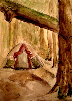
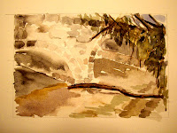
I went on a camping trip to Stokes Forest this weekend. My intention was to get in some mountain biking and to run there many challenging trails. Well....after the 2nd day of running I tore something in my foot, probably a ligament or a tendon who knows....all I herd was a loud rip and that was it ....run over. So I wrapped my foot in an ace bandage a limped five miles back to camp. With the rest of the day to kill I blew the dust off my old watercolors and tried to remember how to do it. The next time I come here I’m going the have to get a french easel and bring the oils.


Friday, June 26, 2009
Bouguerea painting attempt
333MAIL2222222222222.jpg)
I’m still working on this Adophe William Bouguerea painting. I’ve been building up the color by first oiling up the section of the painting I’m working on with a mixture of Walnut oil, Dammar varnish and Turpenoid. I’ve also been adding this mixture to the paints as needed to control the transparency. The more mixture added the more transparent the colors become. If you click on the link it will take you to a great PDF file written by Mark Warker titled Bouguerea at work. There is so much useful information on Bouguerea's process here that I would not have gotten this far into my painting without it.
Sunday, May 17, 2009
Wipe it off, Scrape it off or Paint right over it.

The apples in this painting weren’t working for me so I painted a wine glass over them. I love the freedom of oil painting, because your never really committed to a mistake. You just wipe it off, scrape it off or paint right over it.........Now you just can’t say that about all the other mistakes you make in life... now can you?
Sunday, May 10, 2009
Movies for the Oil Painter, How To Steal a Million

In this elegant "caper" film, Audrey Hepburn stars as the daughter of a wealthy Parisian (Hugh Griffith), whose hobby is copying famous works of art. His replica of a famed Cellini sculpture is inadvertently displayed in an art museum, and he begins to worry that he'll lose his reputation once the experts evaluate the statuette. Audrey decides to rob the museum, and hires a burglar (Peter O'Toole) for that purpose. But the burglar is really a detective, who has every intention of arresting Audrey and her father when the deed is done. All style and little substance, How to Steal a Million is consummately acted by the stars, but the film is stolen hands-down by a "double take" reaction from French comic actor Moustache. The film was originally titled How to Steal a Million Dollars and Live Happily Ever After, which gave the whole game away and thus was pared down before release
Friday, May 8, 2009

333MAIL.jpg)
Sunday, May 3, 2009
Tinting With Oil Color

After tightening up the drawing a little more, I started tinting some areas with the colors one at a time using Burnt umber, Prussian blue and Chromatic black.
Drawing with a paint brush
.jpg)
With a few different size bright brushes I cut into the dark’s to sharpen the drawing, adding detail and light . Basically I’m drawing with a paint brush. Adding and subtracting light where needed to give the form dimension.
Values In Oil Painting

The canvas was toned with a mix of Chromatic black., Burnt umber and Prussian blue.
Using the toned canvas as a middle value I added dark’s where needed and pulled off paint with a rag to get the light values. At this point I just want to build an abstract likeness of my subject, I don’t want to fuss with details at this point, mostly its about getting the values correct.
Using the toned canvas as a middle value I added dark’s where needed and pulled off paint with a rag to get the light values. At this point I just want to build an abstract likeness of my subject, I don’t want to fuss with details at this point, mostly its about getting the values correct.
Subscribe to:
Posts (Atom)